Key Takeaways
- Choose your font based on how people will read it. Serif fonts are better for print. Sans serif fonts are better for screens.
- Fonts have personalities. Sans serif feels modern. Serif feels classic. Match the font to your brand.
- Make sure people can read your font. Sans serif is easier to read for many people.
- Use serif fonts for long blocks of text. Use sans serif fonts for headlines and short bits of text.
- Serif fonts look better on paper. Sans serif fonts look better on screens.
- Check how the font looks on different devices.
- You can mix serif and sans-serif fonts. Just make sure it looks good!
- Don’t just pick a font because it’s trendy. Pick a font that works well.
Fonts are an important aspect of any written material. They profoundly impact how readers perceive the information in a text. This makes it critical to ensure one chooses them wisely. When picking fonts, the debate between sans vs sans serif fonts becomes a topic of interest for business owners, designers, typographers, and even casual observers.
The choice between these two font families is more than an aesthetic preference. It shows a deeper understanding of context, readability, and the psychological impact of typeface design.
Sans serif fonts feature clean lines and convey a sense of modernity and simplicity. Serif fonts, with decorative strokes, conjure a sense of tradition and formality. How does one decide which one best fits their use case?
This blog will compare sans vs sans serif fonts. Understanding the difference between serif vs sans serif fonts will help you decide which font is ideal for your specific use case.
Let’s begin!
Table of Contents
- Key Takeaways
- Why Choosing a Suitable Font is Important?
- What is a Serif Font?
- What is a Sans Serif Font?
- The Difference between Sans vs Sans Serif
- Sans vs Sans Serif: Tips for Choosing According To Your Needs
- Which One is the Right Option?
- Conclusion – Sans vs Sans Serif
- FAQs
Why Choosing a Suitable Font is Important?
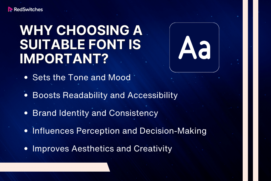
It can be easy to overlook the importance of fonts, but this can be a damaging aspect for your business in the long run. Below are a few reasons why choosing a suitable font is crucial:
Sets the Tone and Mood
Your chosen fonts set the tone and mood of your communication. For instance, a playful, handwritten font might be ideal for a children’s book, while a clean, sans-serif font like Helvetica is best suited to professional business documents. The wrong font can send a conflicting message to your audience.
Boosts Readability and Accessibility
Readability is crucial, especially when dealing with large amounts of text. Fonts that are too decorative or difficult to read can strain the eyes and deter readers. Simple, legible fonts ensure your message is available to a broader audience, like those with visual impairments.
Brand Identity and Consistency
Credits: FreePik
A consistent font is a vital part of brand identity for businesses. It helps establish recognition and builds trust with your audience. Using consistent fonts across all your materials – from your logo to your website to your email newsletters – creates a cohesive brand experience.
Influences Perception and Decision-Making
The psychology behind fonts is profound. Research has shown that font can affect how information is processed and decisions are made. A study showed that readers were more likely to agree with an opinion if it was written in a font that was easy to read. This highlights how the right font can impact opinions and behaviors.
Improves Aesthetics and Creativity
Fonts are an integral aspect of design aesthetics. They offer a creative avenue, allowing designers to express a mood, era, or style. A well-chosen font can elevate your design, making it more appealing and engaging for the audience.
What is a Serif Font?
Credits: FreePik
Before discussing what is the difference between serif and sans serif it is important to understand the individual meanings of sans vs sans serif fonts.
A serif font is a typeface represented by small lines or attractive strokes (serifs) at the finish of every letter’s larger strokes. These Serifs can contribute to a classic or formal touch, though some serifs (like slab serifs) can also feel bold and modern. Serif fonts originated from the Latin alphabet inscriptions in stone during the Roman Empire. These fonts have an extensive history in print media.
Serif fonts are widely used in newspapers, books, and magazines due to their readability in printed text. Some popular serif fonts include Garamond, Times New Roman, and Georgia. Serifs can make text more legible by creating a distinct line that helps guide the reader’s eye along a block of text.
While serif fonts are less commonly used in digital media than their sans-serif counterparts, they still significantly convey a sense of authority, tradition, and respectability in various design contexts.
Do you want your website design to stand out? Read our piece about 2024’s Best Free WordPress Blog Themes and select the ideal design for your site.
When Should You Use a Serif Font?
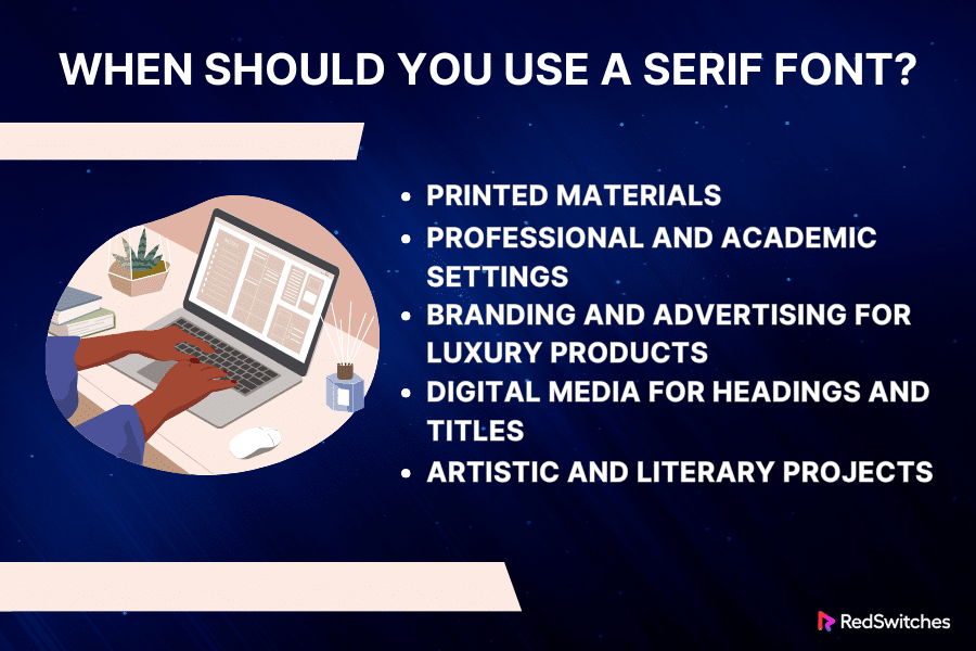
Below are a few instances where using a serif font is best:
Printed Materials
One of the most traditional and effective uses of serif fonts is in printed materials. The serifs on these fonts help guide the reader’s eye along the lines of text. This makes the reading experience comfortable over extended periods.
These fonts create an invisible line along the bottom of the letters, helping our brains to process the information more efficiently. For this reason, many classic novels and important documents are often printed in serif fonts.
Professional and Academic Settings
Serif fonts are synonymous with professionalism and formality. This makes them an excellent choice for settings that require a degree of solemnity and authority. For instance, legal documents, resumes, and letters of recommendation can benefit from the formal tone set by a serif typeface.
Many institutions in the academic sector prefer serif fonts for the body text of research papers and dissertations, as they convey a sense of seriousness and credibility.
Branding and Advertising for Luxury Products
The choice of font can significantly influence consumer perception in the advertisement and branding sector. Serif fonts are often associated with tradition, respectability, and reliability.
Luxury brands frequently use serif fonts in their logos and marketing materials to evoke a sense of elegance and timelessness. A serif font could be ideal if your brand aims to convey similar values or appeal to a demographic that appreciates classic styles.
Digital Media for Headings and Titles
Sans-serif fonts are generally more legible on digital screens, especially for body text. Serif fonts can be highly effective for headings, titles, and other larger text elements on websites and digital publications.
They can incorporate sophistication and contrast nicely against a predominantly sans-serif body text. However, it is important to ensure that the serif font is legible on various screen sizes and resolutions.
Artistic and Literary Projects

Credits: Pexels
Serif fonts have a storied history and an artistic flair that can be useful in creative projects. They are popular in the literary and arts community and used in poetry books, magazines, and art gallery brochures. Their classic feel can also be a great asset in historical or period-themed projects, where they add authenticity and mood.
Three Types of Serif Fonts
Below are the three types of serif fonts:
Transitional Serif
Transitional serif fonts emerged between the late 17th and mid-18th century. These fonts played an integral role in bridging the old-style and modern serif types. Their contrasting feature is that they contrast thick and thin strokes more than earlier humanist serif fonts.
The serifs in transitional fonts are more refined and sharp, and the overall structure is more geometric. Times New Roman is a classic example of a transitional serif font.
Humanist Serif
Humanist serif fonts, also known as old-style serifs, are inspired by the calligraphic and handwritten styles of the Renaissance period. These fonts have a low contrast between thick and thin strokes. The serifs are more rounded and less uniform than those in later serif styles.
Humanist serif fonts are designed to mimic the rhythm and flow of human handwriting, making them highly legible and comfortable for extended reading. Garamond is an example of this type of font.
Slab Serif
Slab serif fonts were introduced in the early 19th century. They feature thick, block-like serifs and lack curvature. Another characterization feature was the minimal or no contrast between thick and thin strokes.
Slab serif fonts convey a bold and modern making them ideal for headlines, posters, and advertising. They are less commonly used in body text due to their heavy appearance. Rockwell is a well-known example of a slab serif font.
Also Read: Top 17 Best WordPress Page Builders For 2024.
What is a Sans Serif Font?
A sans serif font is a typeface that lacks serifs at the end of strokes, which is characteristic of serif fonts. The term sans serif comes from the French word sans, meaning without. These fonts are known for their simple, straight lines and uncomplicated, unadorned forms, giving them a contemporary and streamlined appearance.
Sans serif fonts were introduced in the 19th century and quickly gained popularity in the 20th century. One key reason for their popularity was that they aligned with modernist design principles, which emphasized minimalism and clarity.
Sans serif fonts are widely used for digital media, including website content, because they are readable on screens. Due to their clear and legible style, they are also prevalent in graphic design, signage, and corporate branding. Arial, Helvetica, and Verdana are popular examples of sans-serif fonts.
The absence of serifs makes these fonts appear more straightforward and contemporary. This makes them a common choice for conveying a sense of modernity and approachability in design.
When Should You Use a Sans Serif Font?
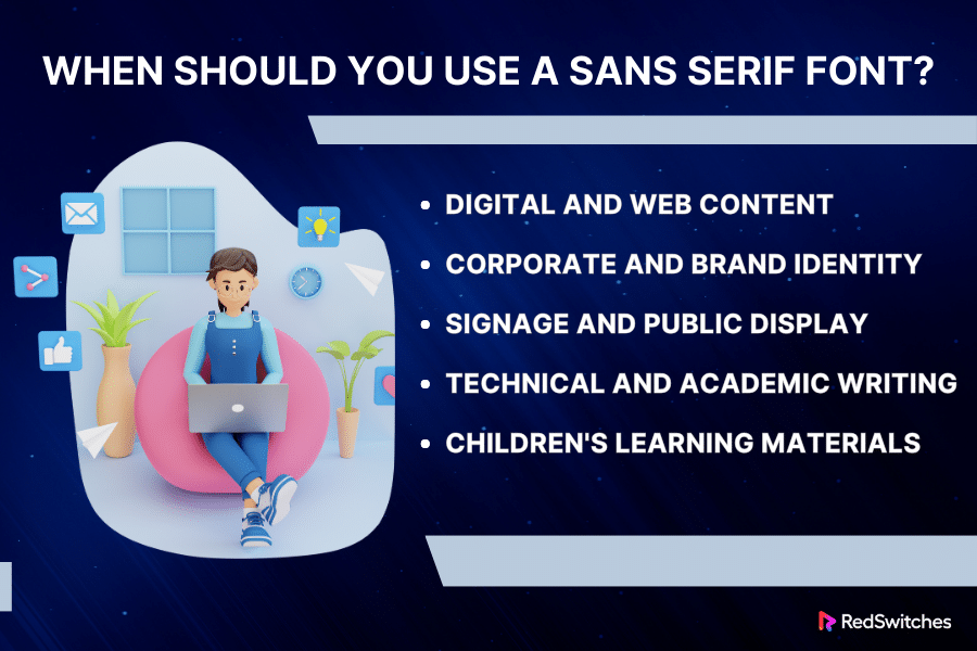
Below are a few instances where using a sans-serif font is best:
Digital and Web Content
Digital media is among the most common applications for sans-serif fonts. On screens, whether computer monitors, smartphones, or tablets, sans serif fonts tend to display more clearly, especially in smaller sizes.
The lack of serifs makes each character more distinct and reduces the blur on low-resolution screens. Websites, mobile apps, and digital advertisements benefit greatly from sans serif fonts like Arial or Google’s Roboto, as they ensure legibility and a modern look.
Corporate and Brand Identity
Sans serif fonts are often associated with simplicity, modernity, and approachability. These qualities make them a highly sought-after choice for corporate branding and identity. Companies looking to display a forward-thinking, clean, and efficient image often pick sans-serif fonts in their logos, marketing materials, and internal communications. Popular brands like Google, Microsoft, and Netflix use sans serif fonts in their logos to communicate a sense of innovation and accessibility.
Signage and Public Display
The high legibility of sans-serif fonts makes them a perfect fit for signage, public transportation displays, and any environment where quick readability is critical. The straightforward design of these fonts allows for easy recognition from a distance or at a glance, which is crucial in high-traffic or fast-paced settings. Safety signs, airport and subway signage, and street names often use sans-serif fonts for this reason.
Technical and Academic Writing
Clarity and straightforwardness are essential in academic and technical contexts. Sans serif fonts are often used in graphs, diagrams, and PowerPoint presentations to ensure the information is easily digestible. While serif fonts are traditionally used in long-form texts like books and academic papers, sans serif fonts are favored in presentations and short-form content within these fields.
Children’s Learning Materials
Sans-serif fonts are often the go-to choice for early reading materials and educational content for children. Their simple and unembellished style is easier for young readers to understand, making them ideal for children’s books, educational websites, and classroom materials. Sans serif’s simplicity helps reduce the complexity and potential confusion that decorative fonts might cause.
Also Read: 7 Best Text Editors For Linux In 2023.
Three Types of Sans Serif Fonts
Below are the three types of sans-serif fonts:
Humanist Sans Serif
Humanist sans serif fonts are distinguished by their more organic and calligraphic qualities, showing the influence of traditional letterforms and handwriting. These fonts have more variation in line width, which gives them a warmer and more human touch. The letter shapes are more closely related to how letters are drawn by hand, making them highly comfortable in extended reading.
Humanist sans serif fonts are often used in print and digital media for their readability and friendly appearance. Gill Sans is a well-known example of humanist sans serif.
Geometric Sans Serif
As the name suggests, geometric sans serif fonts are based on simple geometric shapes like squares, circles, and triangles. These fonts are characterized by their uniform line width and often perfectly circular letterforms. They offer a modern, clean, and minimalist aesthetic.
Geometric sans serif fonts are popular in logos, headings, and other applications where a sleek, modern look is desired. Futura is a classic example of a geometric sans serif font.
Transitional Sans Serif
Transitional sans serif fonts symbolize a style that combines qualities of both humanist and geometric sans serif types. They feature the readability and warmth of humanist fonts with some of the simplicity and modernity of geometric designs.
Transitional sans serif fonts often have less stroke width variation than humanist fonts but more than geometric fonts. They balance approachability and modernist styling, making them versatile for various applications. Frutiger is an example of a transitional sans serif font.
Now that we have discussed the meanings, use cases, and types of sans vs sans serif typeface, let’s explore what’s the difference between serif and sans-serif typefaces to help you choose the best font.
The Difference between Serif vs Sans Serif
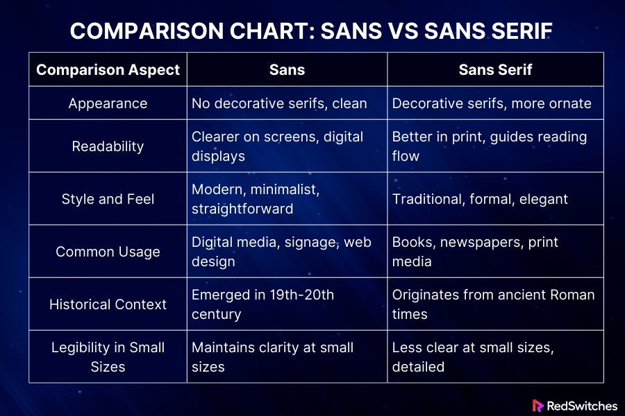
Here is a breakdown of the difference between sans and sans serif fonts:
Serif vs Sans Serif: Appearance
Let’s discuss the appearance differences between both fonts.
Sans
Sans, short for sans serif fonts, is defined by its lack of serifs – the small strokes attached to the end of larger strokes in letters. This gives them a clean, modern, and streamlined look. Sans fonts are characterized by their simplicity and geometric clarity, making them versatile for various design contexts.
Sans Serif
This term sans serif may confuse some as it’s often used interchangeably with ‘sans.’ This is why it’s important to remember that in some contexts, ‘sans serif’ can imply a subcategory or a specific style within the broader sans serif family.
For instance, a designer might refer to a ‘grotesque sans serif’ or a ‘humanist sans serif,’ each with unique characteristics. These fonts still lack serifs but might have varied stroke weights and slightly more nuanced designs than the most basic sans fonts.
Serif vs Sans Serif: Readability
Let’s examine the Readability distinctions between the two font types.
Sans
Sans fonts are generally considered more readable on digital screens. Their clean lines and simple forms make them easily read at various screen resolutions and sizes. They are commonly used for web design, user interfaces, and digital content, where clarity and legibility are important.
Sans Serif
The readability of sans serif fonts in printed materials can be debated. While they are clear, some argue that the lack of serifs can make longer texts more challenging to read in print.
This is because serifs are thought to steer the eye along lines of text, creating a more effortless reading experience. However, this difference in readability is often subtle and can be subjective, varying from person to person.
Looking for instant dedicated servers? Visit: Instant Dedicated Server In The Best Prices In The Industry.
Serif vs Sans Serif: Style and Feel
Let’s explore how these two fonts differ regarding Style and Feel.
Sans
Sans fonts are distinguished by their clean, simple lines. These fonts lack the small projecting features called ‘serifs’ at the end of strokes. The style of sans fonts is modern and minimalistic, often conveying a sense of simplicity and sleekness.
They are typically straightforward, making them clear and easy to read, especially in digital formats. Sans fonts are often used to project a sense of clarity, approachability, and contemporary aesthetics.
Sans Serif
Sans serif fonts feature small lines or extensions at the end of their strokes. Serif fonts offer a classic and formal feel, often seen as elegant and established. They carry a sense of tradition and history, making them suitable for settings that require a degree of solemnity or authority.
Serif fonts are often used in print media like books and newspapers due to their readability in long text blocks.
Serif vs Sans Serif: Common Usage
Let’s talk about how the two fonts vary in Common Usage.
Sans
Sans fonts are incredibly versatile and are used extensively in digital media. Due to their clear and straightforward appearance, they are ideal for website content, online articles, user interfaces, and digital advertising.
Sans fonts are also popular in graphic design for logos, signage, and any platform where clarity and readability are critical. Their modern look makes them suitable for contemporary brands and media.
Sans Serif
Sans serif fonts are commonly associated with more formal or traditional print media. Serif fonts are a staple in the publishing industry as they are believed to facilitate ease of reading in printed works.
They are also favored in official documents, certificates, and academic papers. Serif fonts can add elegance and formality to branding and advertising, especially for businesses that want to project a sense of heritage and sophistication.
Serif vs Sans Serif: Historical Context
Let’s review how each font stands out in Historical Context.
Sans
The history of sans serif fonts is relatively modern. Their popularity surged in the 19th and 20th centuries. These typefaces emerged as a counterpoint to earlier periods’ ornate and decorative styles.
The Industrial Revolution played a major part in their rise, aligning with the era’s shift towards minimalism and functionalism in design. Sans serif fonts were seen as a symbol of modernity, simplicity, and clarity, breaking away from traditional aesthetics.
Sans Serif
Serif fonts have a much older history, dating back to the Roman Empire. The serifs were thought to originate from brush strokes or chiseling in stone. Over the centuries, serif fonts dominated printed text, esteemed for their elegance and readability. They were the de facto choice in books, newspapers, and official documents, exuding a sense of formality and tradition.
Serif vs Sans Serif: Legibility in Small Sizes

Credits: Unsplash
Now, We’ll compare the differences between the Legibility in Small Sizes between both font families.
Sans
Sans serif fonts are often praised for clarity, especially on digital screens. Their clean and straightforward design, without the additional details of serifs, makes them highly readable even at smaller sizes. This clarity is why sans serif fonts are popular in web design, user interfaces, and any platform where text might appear in a reduced size.
Sans Serif
While serif fonts are generally considered excellent for printed materials, their clarity at small sizes can be challenging, especially on digital screens. The serifs can create a bit of visual clutter, making the text appear less crisp and more complex to read at smaller sizes.
Although this doesn’t diminish their effectiveness in print, where the contrast and detail of ink on paper naturally aid in reading comfort, it does mean that for small text on screens, sans serif fonts might be the better choice.
Also Read: 10 Best Linux Terminal: Features And Recommendations.
Even after understanding the differences between sans vs sans serif, it can be difficult to choose between the font families. Find yourself in the same boat? Here are a few tips to simplify the decision-making process:
Consider the Context and Purpose
When deciding between sans vs sans serif, the context in which the text will be read is critical. Serif fonts are traditionally used in print media as they are considered easier to read in long, printed texts. Sans serif fonts are often the go-to choice for digital content, as they display more cleanly on various digital screens. Think about where your text will be primarily read and choose accordingly.
Test Across Different Mediums and Devices

Credits: Unsplash
Always test how your chosen font looks across different mediums and devices, especially if your content will be viewed both online and in print. Pay attention to clarity, spacing, and overall aesthetics on various platforms.
Reflect on the Brand Personality
Fonts have personalities. Hence, your chosen font should always go with your brand image since it will impact how your brand is perceived. A tech startup might prefer a sans-serif font to convey a sense of modernity and innovation, whereas a law firm might opt for a serif font to reflect tradition and reliability. Align your font choice with your brand’s identity and values.
Readability and Accessibility
Consider your audience’s readability needs. For instance, sans serif fonts are generally recommended for audiences with dyslexia. For small text sizes or low-resolution displays, sans-serif fonts are more legible. Always prioritize readability and accessibility.
Experiment with Contrast and Pairing
Feel free to mix and match. Using a serif font for headings and a sans serif font for body text (or vice versa) can create an engaging contrast and help guide the reader’s attention. The key is maintaining harmony and not overwhelming the reader with too many styles.
Look at the Trends, But Don’t Be Dictated by Them
While staying updated with current trends is good, your font choice should not be only based on what’s fashionable. Trends come and go, but good design principles are timeless. Ensure your choice stands the test of time and serves your purpose well.
Which One is the Right Option?
Besides understanding the difference between serif and sans serif font, choosing a font requires considering factors like the context of use, audience, and medium. Below are a few factors that help you decide which font between sans vs sans serif might be the right option:
- Readability and Medium
-
- Print: Serif fonts are often considered best for printed material as the serifs guide the eye along the lines of text.
- Digital Screens: Sans serif fonts are generally clearer and more legible on digital screens. This makes them a preferred choice for websites and online content.
- Design and Aesthetic
-
- Traditional and Professional: Serif fonts are associated with tradition, reliability, and respectability. They work well for formal documents, law firms, newspapers, and academia.
- Modern and Clean: Sans serif fonts offer a modern and cleaner appeal. They are suitable for tech companies, contemporary branding, and digital platforms.
- Audience and Context
-
- Consider your target audience and the message you wish to put out. Sans serif may be better for a younger, more modern audience. For a more traditional, scholarly audience, serif could be best suited.
- Specific Project Requirements
-
- Long Texts: Serif fonts can be easier on the eyes for extensive reading materials, like novels or reports.
- Short Texts and Headlines: Sans serif fonts are excellent for website headers, advertisements, and signage due to their bold and clear appearance.
- Personal Preference and Industry Standards
-
- Some industries have standard practices regarding font use (e.g., legal documents mostly use serif fonts). Personal preference also plays a significant role in the choice.
- Versatility and Pairing
-
- Consider how the font pairs with other design elements. Although both serif and sans serif fonts can be versatile, the choice depends on the overall design scheme.
Conclusion – Serif vs Sans Serif
Choosing between sans vs sans serif fonts is a crucial decision in design. It can impact everything from brand perception to readability. While sans-serif fonts offer clarity and a contemporary feel, ideal for digital platforms, serif fonts offer sophistication and are often preferred for printed materials. Understanding the strengths and applications of sans vs sans serif is key to effective design and communication.
The decision extends beyond mere font choice for businesses and individuals looking wishing to leave a mark online. Your digital presence needs a reliable and efficient hosting service.
RedSwitches offers premium hosting solutions that ensure your website, with its carefully chosen typography, is accessible, fast, and secure. Explore our website today to find the perfect hosting solution that aligns with your unique digital needs, ensuring your message is well-designed and well-received.
FAQs
Q. Which is better for reading sans serif vs serif?
Serif fonts are generally considered better for reading in printed material due to their serifs guiding text flow. Sans serif fonts are often preferred for screen reading due to their clear and simple design.
Q. Is Arial sans or sans serif?
Arial is a sans-serif font known for its clean and straightforward design. It lacks the decorative serifs at the ends of its strokes.
Q. What are the key differences between serif and sans serif fonts?
The key differences lie in decorative strokes known as serifs in serif fonts, whereas sans serif fonts are characterized by their absence of such strokes, resulting in a clean and minimalistic look.
Q. How do I choose between a serif and a sans-serif font for my project?
Consider the message and tone of your project. Serif fonts are often associated with tradition, elegance, and formality, while sans-serif fonts convey modernity, simplicity, and minimalism. Choose based on the vibe you wish to convey.
Q. Why is it important to choose the right font for my brand?
The font used for your brand reflects its personality and can influence how your audience perceives it. Selecting a font that aligns with your brand identity and the message you want to convey is crucial.
Q. What’s best to mix and match serif and sans-serif fonts?
Combine fonts that complement each other. For a balanced and visually appealing combination, pair a bold sans-serif heading with a classic serif body text.
Q. What are some popular examples of serif and sans-serif fonts?
Some popular serif fonts include Times New Roman, Garamond, and Baskerville, while common sans-serif fonts include Helvetica, Arial, and Futura.
Q. When should I consider using a serif font?
Serif fonts are often preferred for printed materials and longer blocks of text, such as books, newspapers, and magazines, as the serifs assist with readability and guide the reader’s eyes along the lines of text.
Q. Why would I choose a sans-serif font for my project?
Sans-serif fonts are a popular choice for digital platforms, websites, and screens as their clean and modern appearance often enhances readability on electronic devices.
Q. How do I pick the right font for the message I want to convey?
Consider the emotions and associations that different fonts convey. For instance, if you want to convey tradition and authority, a serif font might be suitable, while a sans-serif font may work better for a modern and approachable message.